Web design for consultants
Your website is selling one person's judgement. Most consultant sites bury that person under a borrowed corporate voice. Here is what earns trust instead.
Hiring a consultant is hiring a person. Not a methodology, not a logo, a person whose judgement someone is about to bet a real problem on. Which makes it odd that most consultant websites work so hard to hide the person. The royal "we", the stock photo of a glass meeting room, a services page that could belong to any of forty firms. The one thing a visitor arrived to assess is the one thing the site refuses to show them.
The credibility paradox
There is a genuine tension here, so let's name it. Look too big and you read as evasive. Any client worth having will discover you are one person on the first call, and now the site feels like a small lie told early, which is a poor start for a relationship built on trust. Look too small and you read as a hobbyist: a thin single page, no visible process, nothing that suggests you have done this before.
Most consultants respond by hunting for a safe point between the two. That is the wrong move, because size is the wrong axis entirely. Nobody hires a consultant for being the right size. They hire for judgement, and judgement shows up in specifics.
What earns trust on a consultant's site
Four things do most of the persuading, and none of them are design flourishes.
- A point of view. Something you believe about your field that a visitor could disagree with. "We deliver tailored solutions" is not a point of view, it is the absence of one. The consultants whose sites work sound like someone with opinions, because opinions are the product.
- A specific offer. "Strategy and transformation" is wallpaper. A named engagement, who it is for, what it covers and how it runs reads like a professional who has packaged their thinking. Naming your offer is not limiting, it is what makes you referable.
- A named process. Steps with names are quiet proof you have done this more than once. They also set expectations before the first call, which protects your time as much as it reassures the client.
- Proof written honestly. "Delivered significant efficiencies" persuades nobody, because nobody can check it. Short case notes do the job better: the situation, what you did, and what changed, in the client's own words where you can get them. One kind, specific sentence from a real client is worth a page of adjectives.
Fewer pages, done properly
A consultant's site does not need to be big. It needs a home page that says who you help and what you fix, one page per offer, an about page that actually says something, proof, and a way to contact you. Five or six pages, each doing a clear job. If you publish, add a writing section, since a consultant who thinks in public rarely regrets it.
What you should resist is the mega-site: the extra service pages, the "our approach" section padded to look institutional, the resources hub with three items in it. Every page added to look bigger dilutes the one asset you actually have, which is a single credible voice.
Where I stand, honestly
I have not built a consultant's site yet, and I am not going to invent a track record by describing one vaguely. My recent work is an affordable housing platform, a mortgage adviser matching service and a film studio's portfolio. What that work shares with a consultant's brief is the part that decides whether a site works at all: structure agreed before any design happens, copy treated as the foundation rather than the filler, and one clear action on screen at every point. BrokerMatch is a business that lives or dies on one page earning the trust of anxious visitors. That is closer to a consultant's homepage than it first appears.
A process built for people who bill for their time
You sell hours. An open-ended web project consumes them, usually in the least billable form there is: chasing, reviewing, renegotiating. So the shape of the engagement matters as much as the result.
My builds are fixed price, agreed before anything starts. Bespoke marketing sites from £2,500, conversion-focused builds from £5,000, all of it set out plainly on the pricing page. A typical marketing-site build takes around three weeks, and I have written about exactly where that time goes. Draft copy gets written for you, so the project never stalls waiting for you to find a free evening, and your part arrives in scheduled, predictable chunks: feedback and sign-off, not project management.
If you want to arrive at the first call already ahead, spend ten minutes with the project brief builder. It asks the questions a good kickoff would ask, and it gets the whole brief out of your head before anyone bills a minute for it.
Good questions
Say I. Clients find out you are one person on the first call anyway, and a site that pretended otherwise starts the relationship with a small lie. A confident first person reads as exactly what it is: someone who stands behind their own work.
Usually five or six: a home page that says who you help and what you fix, a page per offer, an about page with a real point of view, honest proof, and contact. A writing section is worth adding if you will actually use it. Fewer pages done properly beat a padded mega-site.
Describe the situation, what you did, and what changed, in the client's words where possible and with their permission. Specific, modest and checkable beats sweeping and vague. If you cannot name the client, describe the engagement honestly and skip the invented percentages.
My builds are fixed price, agreed before work starts. Bespoke marketing sites start from £2,500, conversion-focused builds from £5,000, and ongoing care starts at £150 a month if you want it. The quote never moves once agreed.
A typical marketing-site build takes around three weeks from kickoff to launch. Your side of it is feedback and sign-off at scheduled points, which matters when the time it costs you is time you would otherwise bill.
Other recent builds

Red Moss
Portfolio siteA bold, cinematic portfolio site for a London film duo making original comedy and drama for the screen.
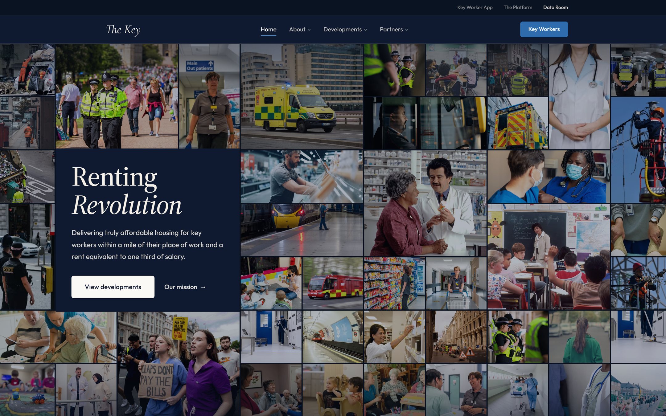
The Key
Marketing site & data roomA brand-led marketing site and a secure investor data room for an affordable-housing venture, with a live demand map and an interactive underwriting model.
Tell me what
you're building.
Thirty minutes, and you'll leave with a clear price and a next step. No pressure, no jargon.
Book a slot instantly, or email me and get a reply the same working day