BrokerMatch
Mortgages are stressful and full of jargon. BrokerMatch needed a landing experience that felt like relief, not more paperwork.

The brief
BrokerMatch matches UK borrowers with specialist mortgage advisers. The product is simple to explain and easy to get wrong: land on the page, answer a few questions, get matched with an adviser who actually handles cases like yours.
The whole business runs through one page doing its job. So the brief was a landing experience where every element earns its place, and where someone anxious about their mortgage options feels calmer with each scroll, not more sold to.
The approach
Conversion work starts with what visitors are worried about, not what the business wants to say. The page was structured around the questions a borrower actually arrives with: is this for people like me, what does it cost, what happens after I fill in the form.
The design keeps one clear action on screen at every point. Copy stays plain: no rate promises, no urgency tricks, just a clear explanation of how matching works and why a specialist adviser matters for non-standard cases.
What shipped
A hand-built, single-purpose landing experience: fast, mobile-first, and passing Core Web Vitals. Design and copy were reviewed and signed off stage by stage in the client portal, with feedback pinned directly on the design previews.
Other recent builds

Red Moss
Portfolio siteA bold, cinematic portfolio site for a London film duo making original comedy and drama for the screen.
The Key
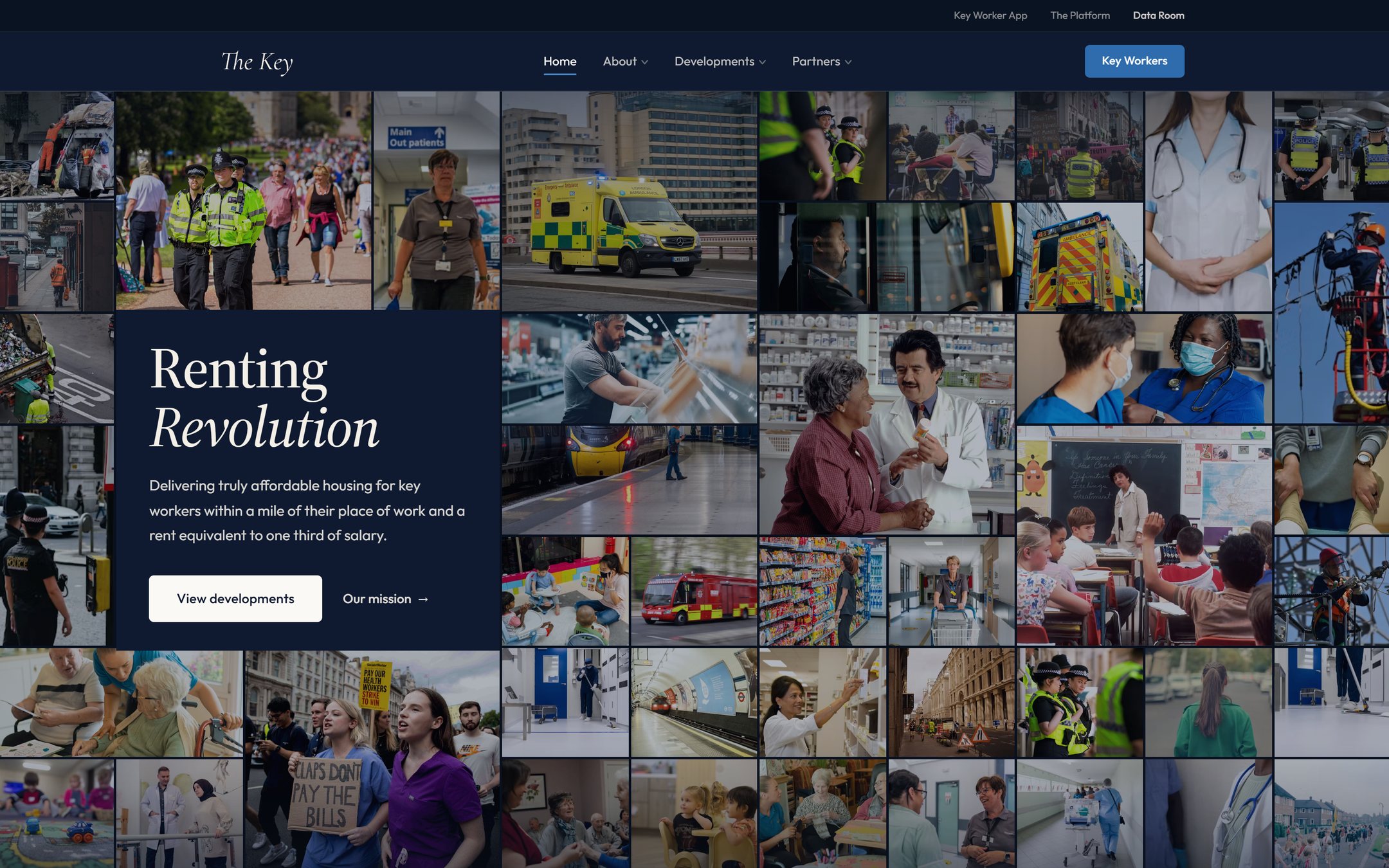
Marketing site & data roomA brand-led marketing site and a secure investor data room for an affordable-housing venture, with a live demand map and an interactive underwriting model.
Tell me what
you're building.
Thirty minutes, and you'll leave with a clear price and a next step. No pressure, no jargon.
Book a slot instantly, or email me and get a reply the same working day