Web design for architects
Clients judge a practice's eye before they read a word. Your site has one job: carry the work beautifully, and never make anyone wait for it.
An architecture practice is judged visually before a single word gets read. Someone lands on your site and within seconds they have formed a view of your eye. Not consciously, and not fairly, but they have. That puts a weight on an architect's website that most business sites never carry: the site itself is evidence. A beautiful portfolio inside a clumsy website reads like a beautiful building behind bad hoarding. People draw conclusions.
The weight problem
Architecture only works on screen at scale. Shrink a double-height living space into a thumbnail and it becomes a stock photo. So the imagery has to be big, full bleed where it earns it, and at a quality that survives a 27-inch monitor.
The catch is that big images are heavy, heavy pages are slow, and slow is the one aesthetic failure every visitor notices. Nobody has ever admired a hero image while watching it load.
The answer is not fewer images or smaller ones. It is engineering. Modern formats like AVIF and WebP. Responsive sizes, so a phone never downloads the file meant for a studio monitor. Lazy loading for everything below the fold, so the first view arrives instantly and the rest follows as it is needed. Compression tuned by eye, to the point just before quality visibly drops, not left on a default setting. Handled properly, a portfolio built almost entirely of large photography can still pass Google's Core Web Vitals. This is a build problem, and it is solvable. It is also the first thing to ask any web designer about, because it is where portfolio sites most often quietly fail.
Minimal, but findable
Architects tend to want minimal websites, which makes sense. The work should speak and the website should shut up. I agree with the instinct.
The trap is that minimalism, pushed too far, strips out the things both people and search engines use to orient themselves. A homepage that is a logo and twelve photographs tells a first-time visitor nothing about where you practise, what you take on or how to reach you, and it tells Google even less.
The tension is real but the trade-off is false. Text can be quiet. Structure can be invisible. Your practice name, your location and the kinds of work you take on can all live on the page in type set so well it reads as design rather than clutter. Restraint is in how things are set, not in whether they exist.
Project pages beat silent galleries
A grid of photographs proves you have completed buildings. A project page proves you can think. The difference matters because a client is not commissioning a photograph, they are commissioning a process: a brief, a set of constraints, and someone with the judgement to resolve them.
So each significant project deserves its own page, and the page needs perhaps 150 words. What the client asked for. What the site, the budget or the conservation officer made difficult. How the design answered. Then let the photography do the rest. As a side effect, a written project page is text a search engine can actually read, which a silent gallery never is.
Typography is a craft signal
Peers read your type the way they read your detailing. So do the better clients, even if they could not say why. Proportion, rhythm, spacing, restraint: typography is the one part of a website that behaves like architecture, and it is the cheapest place to show that the practice's care extends beyond the buildings. A default template font with careless spacing, on the site of a practice that agonises over shadow gaps, is a contradiction visitors feel even when they cannot name it.
An honest note about experience
I have not built for an architecture practice yet, and I would rather tell you that than imply a specialism I do not have. What I can show is the same problem solved in a neighbouring discipline. Red Moss is a portfolio site for a London film duo where the work is the interface: their own film plays full bleed in the hero, typography does the talking between scenes, and the whole thing was hand-built and tuned so the video never gets in the way of performance on a phone. Heavy media, minimal chrome, speed treated as non-negotiable. Swap film for photography and it is precisely the architecture portfolio problem. The rest of my work follows the same pattern: bespoke design, hand-written code, no templates.
Cost and timeline
A bespoke portfolio and marketing site starts from £2,500. If the site's job is to bring in enquiries as well as present the work, with conversion-focused copy and technical SEO foundations, that starts from £5,000. Client portals and other tools are scoped individually. Every price is fixed before work begins and does not move.
A typical marketing site takes around three weeks from kickoff to launch. For architects the honest caveat is that the schedule usually hinges on photography and project write-ups, not on design or code, so start gathering those early. Full detail on what each tier includes is on the pricing page.
Good questions
Modern formats like AVIF and WebP, responsive sizes so a phone never downloads a desktop file, lazy loading below the fold, and compression tuned by eye rather than by default setting. Done properly, a portfolio built almost entirely of large photography can still pass Google's Core Web Vitals. It is an engineering job, not a design compromise.
Give every significant project its own page: the brief, the constraints, and how the design resolved them, in around 150 words. That shows clients how you think, and it gives search engines text to read, which a silent image grid never does. Keep the writing short and let the photography carry the rest.
On the project that earned them, first. An award means most sitting next to the building it recognises. A single quiet list elsewhere covers the rest. A trophy cabinet on the homepage crowds out the work, and the work is what wins the next commission.
A bespoke portfolio and marketing site starts from £2,500. A build structured around enquiries as well as presentation, with conversion-focused copy and technical SEO foundations, starts from £5,000. Anything with logins or client-facing tools is scoped individually. Every price is fixed and agreed before work starts.
Around three weeks for a typical marketing site, from kickoff to launch. For architecture practices the usual bottleneck is not design or code, it is gathering photography and project write-ups. Start collecting those early and the timeline holds.
Other recent builds

Red Moss
Portfolio siteA bold, cinematic portfolio site for a London film duo making original comedy and drama for the screen.
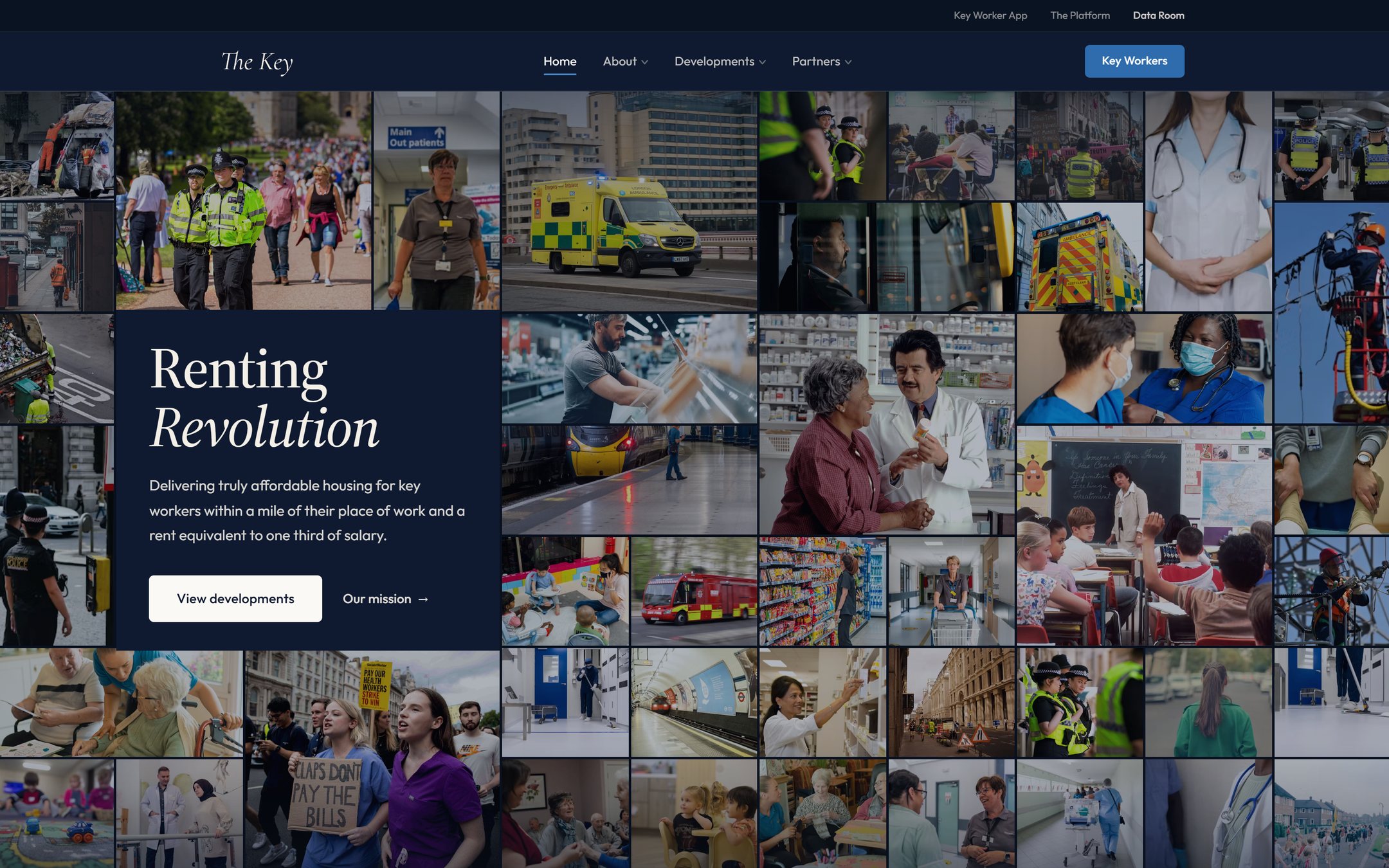
The Key
Marketing site & data roomA brand-led marketing site and a secure investor data room for an affordable-housing venture, with a live demand map and an interactive underwriting model.
Tell me what
you're building.
Thirty minutes, and you'll leave with a clear price and a next step. No pressure, no jargon.
Book a slot instantly, or email me and get a reply the same working day